Real-time Analytics
Metrics and performance data for Focus Indicator
Timeframe:
Advanced Analytics
Monthly Growth
Percentage change in user base over the last 30 days compared to previous period
Category Ranking
Current position ranking within the extension category compared to competitors
Install Velocity
Average number of new installations per week based on recent growth trends
Performance Score
Composite score based on rating, review engagement, and user adoption metrics
Version Analytics
Update frequency pattern and time since last version release
Performance Trends
Analytics data over time for Focus Indicator
Loading analytics data...
About This Extension
Adds a high-contrast outline around the element with keyboard focus
I predominantly use my keyboard to navigate websites, but many sites don't always make it clear where the keyboard is focused. This extension aims to help solve that issue by putting a white or black border around the focused element, depending on whichever results in a higher contrast.
Focus Indicator uses multiple strategies to aim for it to work effectively across all websites, but it can't account for every improper accessibility setup. For example, if a site has a focusable element out of the screen's bounds, it won't show any difference. It also doesn't affect which elements are able to be focused with the keyboard.
It prioritizes function over form. If you'd like, you can disable the extension on certain sites (blacklist them) or you can enable the extension only on certain sites (whitelist them). All settings can be configured by clicking on the extension's icon.
There are two focus indication methods, depending on your preference:
1. Overlay (default, new with version 2)
- Works by having a floating outline above the current focused element's position
- Almost guaranteed to show the outline if it is possible to, EVEN IF the focused element is behind another element
2. On Element
- Works by modifying the current element's focused styles
- The indicator will sometimes end up partly or fully covered up by other elements, but it can be less intrusive
Overlay Mode settings:
- Indicator color mode
- Solid (default) - The outline will be either solid black or solid white
- Hybrid - The outline will be a black and white inversion of whatever is directly behind each individual portion of it
- Outline width (default: 4px) - Adjust the thickness of the outline
- Outline offset (default: 1px) - Set how much space there is between the element and the outline
- Use transition between focused elements (default: off) - Animates focus shifts for better visual tracking
- Use "On Element" mode for text input elements (default: on) - The overlay may cover text while typing in certain text input elements, mainly in online code editors, so "On Element" mode can be used for just those elements instead
Screenshots
1 of 1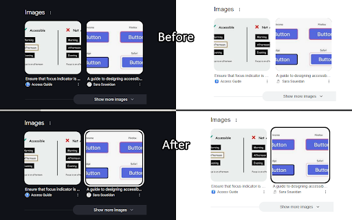
Technical Information
- Size
- 25.88KiB
- Languages
- 1 supported
- Extension ID
- ieandfkgbncm...
Version History
2.1.4
Current Version
Latest
03/05/2025
2.1.3
Previous Version
02/03/2025
2.1.2
Older Version
01/04/2025
Related Extensions
Similar extensions in Extension
VPN Proxy Master: Change IP for Chrome
Extension
Access all websites smoothly on Chrome browser with faster VPN Proxy Master.
50.0M
4.0
1.3K
Jul 4
View Analytics
uBlock Origin
by Raymond Hill (gorhill)
Extension#9 Popular#42 Trending#27 Top Rated
Finally, an efficient blocker. Easy on CPU and memory.
20.0M
4.7
35.3K
Jul 11
View Analytics
Google Classroom
Extension
Classroom helps teachers save time, keep classes organized, and improve communication with students.
20.0M
3.8
1.1K
May 25
View Analytics