Real-time Analytics
Metrics and performance data for CSS PX, REM, EM, VH, VW Converter
Timeframe:
Advanced Analytics
Monthly Growth
Percentage change in user base over the last 30 days compared to previous period
Category Ranking
Current position ranking within the extension category compared to competitors
Install Velocity
Average number of new installations per week based on recent growth trends
Performance Score
Composite score based on rating, review engagement, and user adoption metrics
Version Analytics
Update frequency pattern and time since last version release
Performance Trends
Analytics data over time for CSS PX, REM, EM, VH, VW Converter
Loading analytics data...
About This Extension
Shows CSS size properties for elements
This is CSS Unit Converter px (pixels), em, rem, vh (viewport height), and vw (viewport width) this size convert it.
A unit converter for CSS allows you to seamlessly convert between various CSS measurement units such as px (pixels), em, rem, vh (viewport height), and vw (viewport width). These units are essential in responsive web design, helping ensure consistent layouts across devices and screen sizes. For example, px is an absolute unit, representing a fixed size, while em and rem are relative units, based on the font size of an element or the root element. vh and vw are viewport-based units, representing a percentage of the viewport’s height or width. A converter helps quickly convert a value like 10px into rem, ensuring responsive design consistency across different display environments.
Screenshots
1 of 2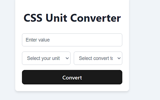
Technical Information
- Size
- 66.71KiB
- Languages
- 1 supported
- Extension ID
- ehhbhncahgnm...
Version History
1.0
Current Version
Latest
11/02/2024
1.-1
Previous Version
10/03/2024
1.-2
Older Version
09/03/2024
Related Extensions
Similar extensions in Developer Tools
GoFullPage - Full Page Screen Capture
by Full Page LLC
Developer Tools
Capture a screenshot of your current page in entirety and reliably—without requesting any extra permissions!
10.0M
4.9
82.6K
Mar 22
View Analytics
TouchEn PC보안 확장
by 라온시큐어
Developer Tools
브라우저에서 라온시큐어의 PC보안 기능을 사용하기 위한 확장 프로그램입니다.
9.0M
1.3
6.2K
May 23
View Analytics
React Developer Tools
by Meta
Developer Tools
Adds React debugging tools to the Chrome Developer Tools.
Created from revision 3cde211b0c on 10/20/2025.
5.0M
4.0
1.6K
Oct 21
View Analytics